Sort by
Sort by

Evolution of the Nestlé logo | Nestlé

Henri Nestlé was one of the first Swiss manufacturers to build up a brand with the help of a logo.

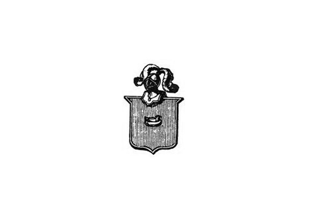
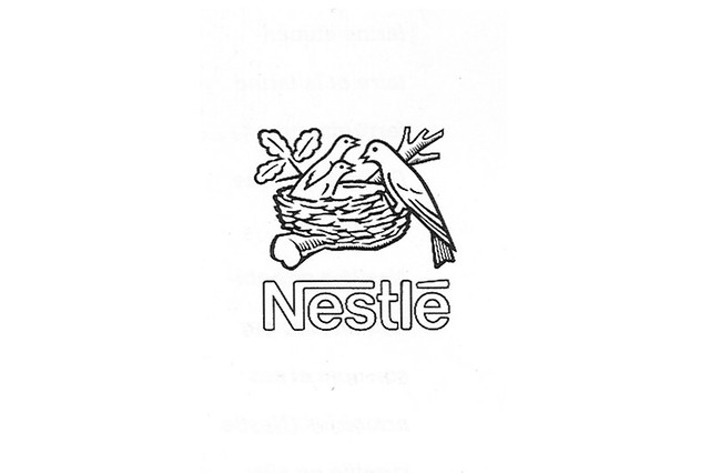
The original Nestlé trademark was based on his family's coat of arms, which featured a single bird sitting on a nest. This was a reference to the family name, which means ‘nest’ in German.

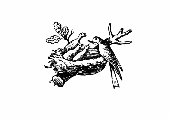
Henri Nestlé adapted the coat of arms by adding three young birds being fed by a mother, to create a visual link between his name and his company’s infant cereal products. He began using the image as a trademark in 1868.

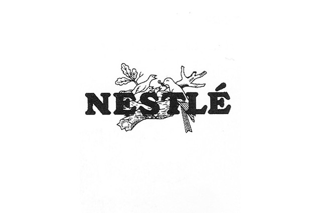
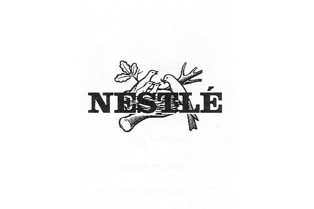
Today, the familiar bird’s nest logo continues to be used on Nestlé products worldwide, in a modified form.

Take a look at how it has evolved over the years.

Logo Evolution

Return to top
Nestlé family coat of arms
Original Nestlé family coat of arms.
VIEW FULL SIZE
1868
1868
1868
Henri Nestlé uses his family's coat of arms as inspiration for the logo (Nestlé = little nest in German) to protect his "Milk Food" ("Farine Lactée"/"Kindermehl") from imitators.
VIEW FULL SIZE
1938
1938
1938
The Nestlé lettering and logo are combined to form an umbrella brand. This becomes the unifying distinguishing mark for different Nestlé products.
VIEW FULL SIZE
1966
1966
1966
The combined trademark is modernised in celebration of the company's 100th anniversary.
VIEW FULL SIZE
1988
1988
1988
Subsidiaries are given standardised names in combination with "Nestlé" and the logo that has now been reduced to two young birds with the writing underneath, becomes the strategic umbrella trademark.
VIEW FULL SIZE
Skip the slideshow